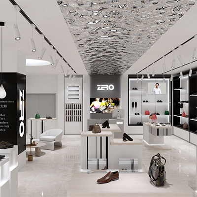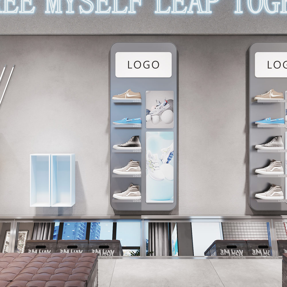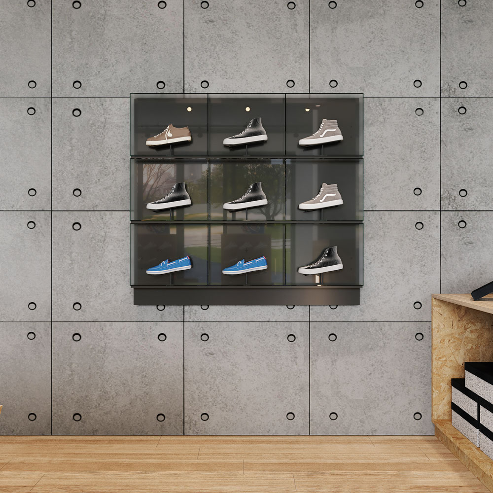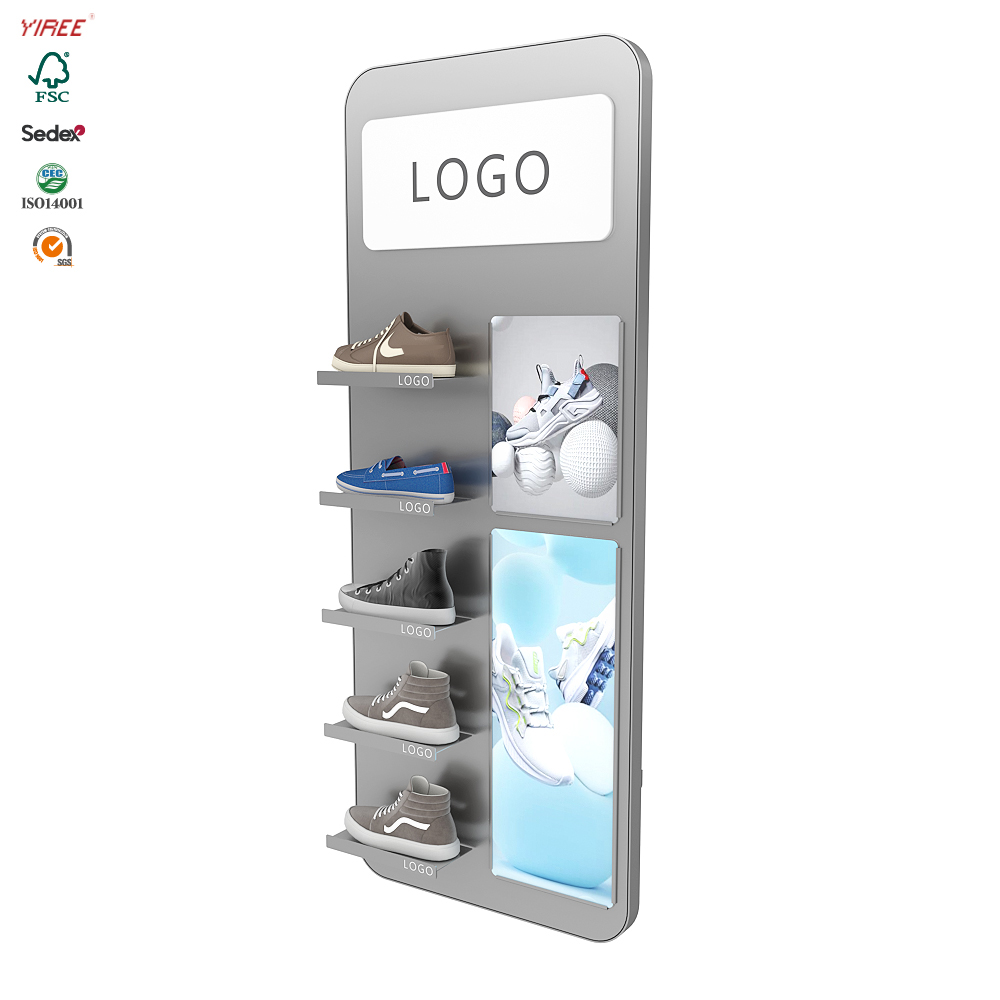
Walk into any sneaker store and you’ll likely encounter an impressive wall of sneakers that stretches from floor to ceiling. These shoe wall displays are more than just visual spectacles; they’re strategic retail choices that go beyond aesthetics. In this article, we’ll take a closer look at why sneaker stores use shoe wall displays, and why new shoe styles are often prominently placed prominently in the middle of the wall.

The power of shoe wall display
1. Effective use of space:
Shoe wall displays are a testament to efficient space utilization. In a retail environment, space is at a premium and maximizing vertical surfaces helps showcase a variety of products without cluttering the floor space. This vertical display allows stores to display a wider variety of shoe styles and sizes, appealing to a wider customer base.
2. Visual impact:
The shoe wall display creates a stunning visual impact and attracts customers’ attention as soon as they enter the store. The variety of colours, patterns and brands neatly arranged on the walls are both eye-catching and inviting. It transforms the store into a sneaker haven, drawing customers deeper into the shopping experience.
3. Browse easily:
Organizing shoes on the wall allows customers to browse easily. Each pair of shoes is visible, allowing customers to easily find the style, size or brand they want. This streamlined approach enhances the shopping experience by reducing the need to sift through stacks of shoe boxes or crowded shelves.
4. Brand Representative:
A shoe wall display is a perfect canvas to showcase various brands in an organized and brand-focused manner. Each brand can have its designated section, allowing customers to explore different options within their preferred brand. This increases brand loyalty and strengthens partnerships between retailers and footwear manufacturers.

Intermediate layout strategy
1. High-quality real estate:
Placing new models in the middle of the shoe wall is a well-thought-out strategy to give them prime space in the store. When customers first approach the display, their eyes are naturally drawn to the middle section. By locating new arrivals here, retailers can ensure customers have immediate access to the latest products.
2. Impulse buying:
The middle placement strategy takes advantage of the psychology of impulse buying. When customers see something new and exciting, they are more likely to be enticed into making an unplanned purchase. It creates a sense of urgency and novelty that can drive sales.
3. Highlight innovation:
New styles often represent the latest in footwear technology, comfort, and style. Placing them in the middle of a shoe wall signals to customers that these shoes are cutting-edge and worth exploring. It also communicates the store’s commitment to keeping up with industry trends.
4. Customer involvement:
The center placement strategy encourages customers to interact with the latest shoe styles. They are more likely to pick up and inspect the shoes when they are in a central, accessible location. This tactile experience can deepen the connection with the product and increase the likelihood of purchase.

A shoe wall display in a sneaker store is a combination of aesthetics and strategy. They utilize space efficiently, create visual impact and simplify the shopping experience. Placing new styles in the middle of a shoe wall is a clever strategy that taps into human psychology, improves customer engagement and increases sales. Next time you walk into a sneaker store, take a moment to appreciate the thought and planning that goes into these displays, and you’ll gain a new appreciation for the art and science of retail displays.


